Global warming is a thing. There’s no denying that temperatures are rising.
In my quest to learn to live with it, I got a Netatmo weather station that measures outside and inside temperature levels (among other things) in 5 minutes intervals.
My goal is to keep the temperature in my apartment as low as possible without installing AC, so my primary questions are:
- When to open the windows in the evening, to let in cool air?
- When to close the windows again?
While the Netatmo website provides a coarse overview of the temperature levels, it’s not particularly helpful in answering these questions because …
- the weekly view shows data points in steps of 3 hours
- data from different sensors can not be merged int
o one graph to understand dependencies (e.g., outdoor vs. indoor temperature).
Here’s a plot I generated by exporting the raw data from Netatmo and some MATLAB coding.
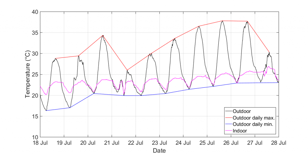
With all the data available in MATLAB I can now go ahead with extracting some critical data points, such as when the outside temperature reaches its minimum or when it starts increasing again. More on that later.